Posted on February 1, 2020 by Rob Gonzalez -
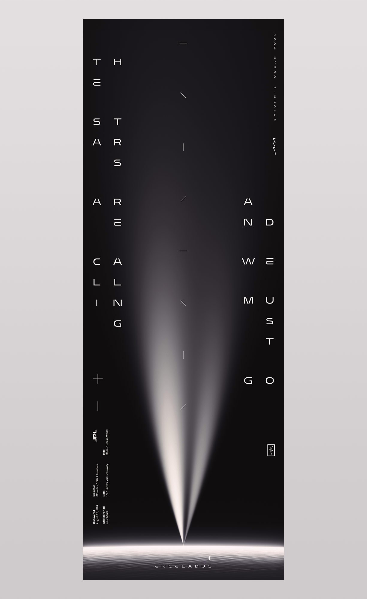
The Stars Are Calling and We Must Go
Few worlds in our solar system are as compelling as Saturn’s moon Enceladus. Covered in ice with the whitest and most reflective surface in the solar system, it has a deep flowing ocean beneath its frozen shell. On its south pole there are cracks and fissures that spray out ocean water directly into space, forming one of the rings of Saturn as it orbits. From these great plumes scientists have collected samples and determined that Enceladus has most of the chemical ingredients needed for life.
We were commissioned to create an art piece based on JPL’s planned mission to enter these vents and gain access to its hidden ocean.
Posted on June 4, 2019 by admin -

This print pays homage to an excerpt from Carl Sagan’s book Pale Blue Dot. Sagan was inspired by an image taken, at his own suggestion, by Voyager 1 on February 14, 1990. As the spacecraft moved towards the outer edges of our solar system, engineers turned it around to gaze upon our tiny planet. Voyager 1 was approximately 4 billion miles away when it captured a portrait of earth, appearing only as a tiny point of light, a pale blue dot.
Sagan later described our planet as “a mote of dust suspended in a sunbeam”.
Created for CommUNITY, a collaborative project between Mucho & San Francisco Design Week (SFDW).
Posted on April 4, 2019 by admin -

Poster for music artist Gryffin with supporting acts by Shallou and GhostDragon.
Client: Another Planet Entertainment
Posted on February 27, 2019 by admin -

Cover typography for The New York Times for Kids, featuring 12 optical illusions that will leave you feeling dizzy.
Art Director: Debra Bishop
Posted on June 22, 2018 by admin -

Typography for an article in WIRED, UK about reincarnating celebrities as holograms.
Posted on June 6, 2018 by admin -

Typography for Texas Monthly’s new lifestyle sections, created in conjunction with their recent magazine and website redesign.
Creative Director: T.J. Tucker
Posted on February 1, 2018 by admin -

We were commissioned to work with the Converse global brand design team to help develop the typography and arrangement for their new visual identity.
The star chevron remains the focal point and is leveraged as part of their heritage, which is also representative of a company that is moving forward. The new wordmark is inspired by aspects of past typographic approaches, which have graced the Converse word throughout their 108 year history.
Posted on December 21, 2017 by admin -

Fedrigoni 365 is a project by design studio TM inviting designers across the UK to contribute to Fedrigoni’s 2018 calendar. The result comprises 365 unique numerical typographic artworks.
Our date was November 13th, 2018.
Posted on November 16, 2017 by admin -

IBM Systems Magazine
Typographic image for an article identifying a shift from selective encryption to full pervasive encryption.
Posted on August 10, 2017 by admin -
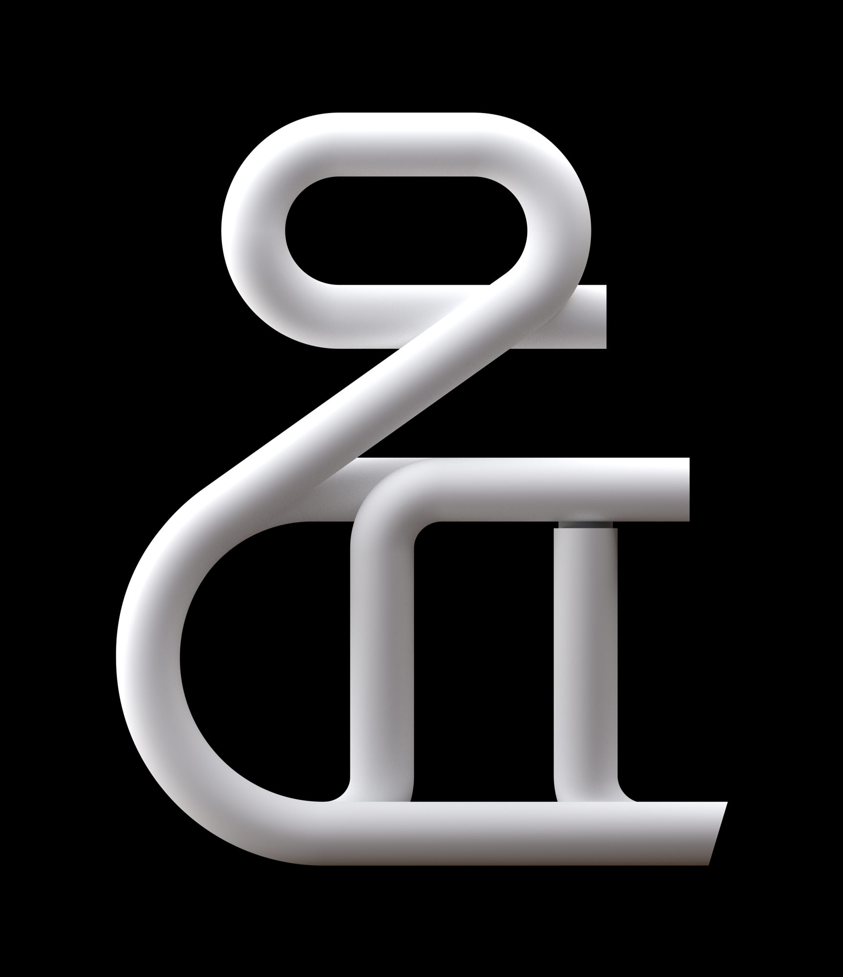
Display typeface for Future Science, Culture & Technology magazine WIRED, UK.
Creative Director: Andrew Diprose
Art Director: Mary Lees
Available now at MyFonts
Recent Comments