Posted on November 10, 2020 by Rob Gonzalez -
We were invited by Tendril to collaborate with their design team on a new film for AutoStore. Tendril were tasked with creating a film that visually captured AutoStore’s Router and its unique and powerful benefits. Using bright, engineered surfaces and consoles, their intent was to create an intimate and up-close perspective of the brand and user experience.
Our role was to use the pre-existing Router logo and transform it into a three dimensional artistic representation of the technology.
Creative Director: Chris Bahry
Director: Joey Recoskie
Art Director: Evaldas Cesnavicius
Executive Producer: Ivelle Jargalyn
Producer: Leah Wesolowski
Music + SD: Cypher Audio
Film designed, directed and produced by Tendril.
For a full credit list visit tendril.ca
Posted on July 8, 2020 by Rob Gonzalez -

Neuro X
Neuro X is a narrow sans serif typeface consisting of three weights with additional rounded versions and matching italics.
It was first drawn as an exploration for a headline font and later expanded on to become a full typeface family. Neuro X explores the extremities of narrow proportions whilst also allowing for eccentric cuts. The typeface has been tightly monospaced and intended for use at larger sizes as a display but can also work at smaller scales for the more courageous among us.
Available now at MyFonts
Posted on July 8, 2020 by Rob Gonzalez -

Features opener for Future Science, Technology and Culture magazine, WIRED UK.
Posted on July 7, 2020 by Rob Gonzalez -

We worked with AMV BBDO to develop a series of typographic designs expressing various types of energy.
The campaign for Smart Energy encourages both the public and businesses to install Smart Meters, which help to provide greener energy and reduce outgoings.
Posted on May 28, 2020 by Rob Gonzalez -
Microsoft approached us to create an alternative typographic take on their Fluent UI logotype which uses their brand typeface Segoe. The idea was that our more expressive version would transform to become Segoe in its rested state. We built and modelled type that took the proportions of Segoe and elevated it, making it technical, physical and transformative. This served as the opener for an animated film introducing Fluent UI at the Microsoft Build 2020 conference.
Fluent UI is a collection of UX frameworks — a cross-platform, open-source approach that enables people to contribute and improve on the design-to-code system.
Direction + Animation: Vincent Schwenk & Vitaly Grossmann
Typography: Sawdust
Sound design: Zelig Sound
Art direction: Nando Costa
Posted on May 6, 2020 by Rob Gonzalez -
LOVE
A short film about love — its power, tension, beauty, and the destruction caused by its loss. The piece explores the polarity between a strong outer appearance and fragility.
Music: Sawdust
Available | SuperRare
Posted on May 5, 2020 by Rob Gonzalez -

2.0
Physical / Virtual
Sold | Make Offer
Posted on February 28, 2020 by Rob Gonzalez -

Adidas invited us to take part in an explorative study utilising their brand mark, brand typefaces and also customised and uniquely made type.
The broad emphasis was on play & disruption, along with everything that goes in between. We were encouraged to manipulate, hack, customise, break, distort and combine to create expressive, playful compositions — this is a selection of our favourites.
Posted on February 28, 2020 by Rob Gonzalez -

Cover art for New Scientist. We’re here because it isn’t. We’re about to find out why.
Art Director: Kathryn Brazier
Posted on February 2, 2020 by Rob Gonzalez -
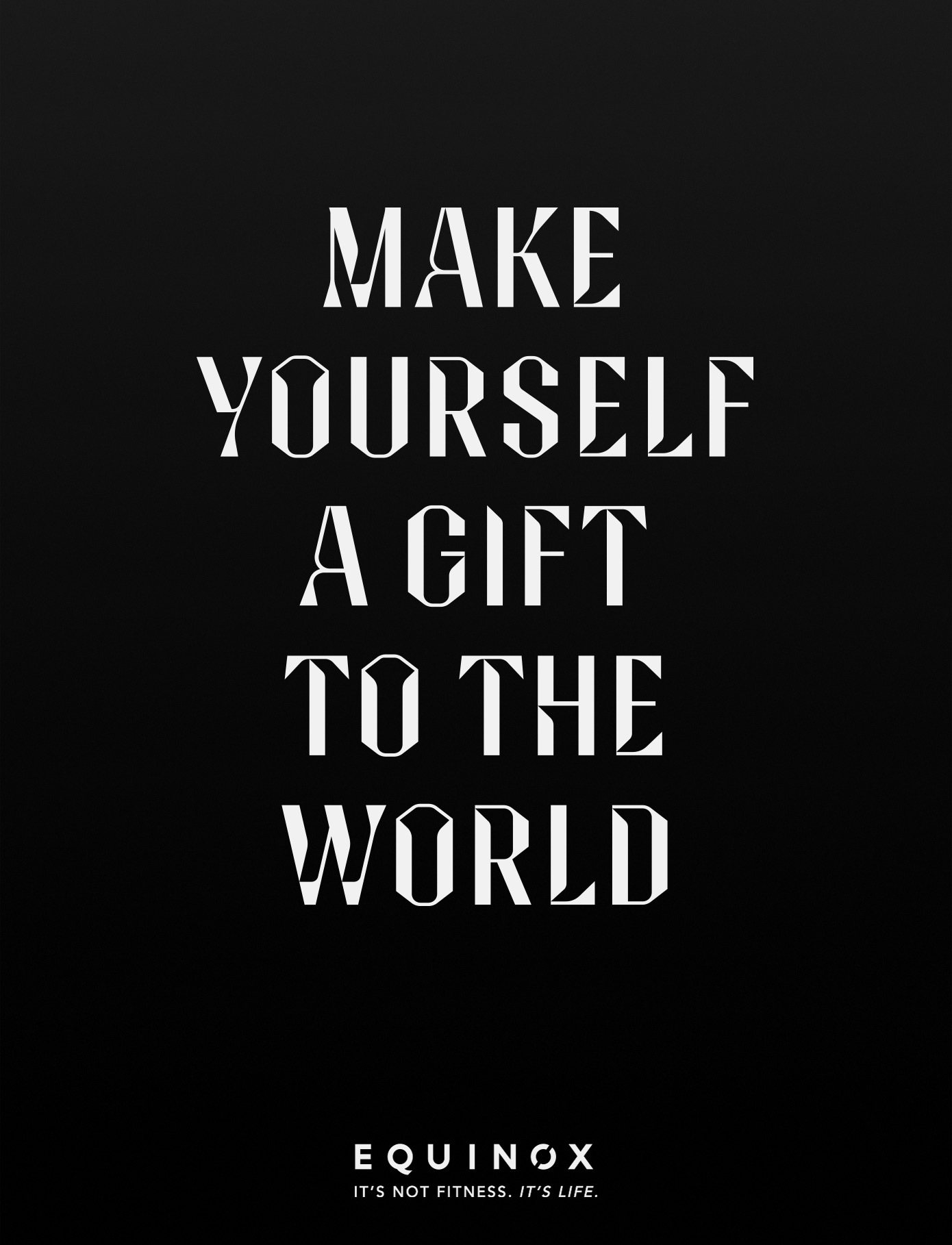
Bespoke campaign typography and system for Equinox gyms, with a tongue in cheek line proclaiming that if you ‘make yourself a gift to the world’ it will make the world a better place.
Commissioned by Droga5, New York.
Typography: Sawdust
Photography: Glen Luchford
Film Director: Floria Sigismondi
Recent Comments