
2.0
Physical / Virtual
Sold | Make Offer
2.0
Physical / Virtual
Sold | Make Offer

Cover art for The Hollywood Reporter.
The unprecedented shutdown of movie theaters and entertainment production caused by the COVID-19 pandemic has upended Hollywood and there may never be a return to normal. The article takes an inside look at how the industry prepares to adapt.
Creative Director: Peter Cury

Adidas invited us to take part in an explorative study utilising their brand mark, brand typefaces and also customised and uniquely made type.
The broad emphasis was on play & disruption, along with everything that goes in between. We were encouraged to manipulate, hack, customise, break, distort and combine to create expressive, playful compositions — this is a selection of our favourites.

Cover art for New Scientist. We’re here because it isn’t. We’re about to find out why.
Art Director: Kathryn Brazier
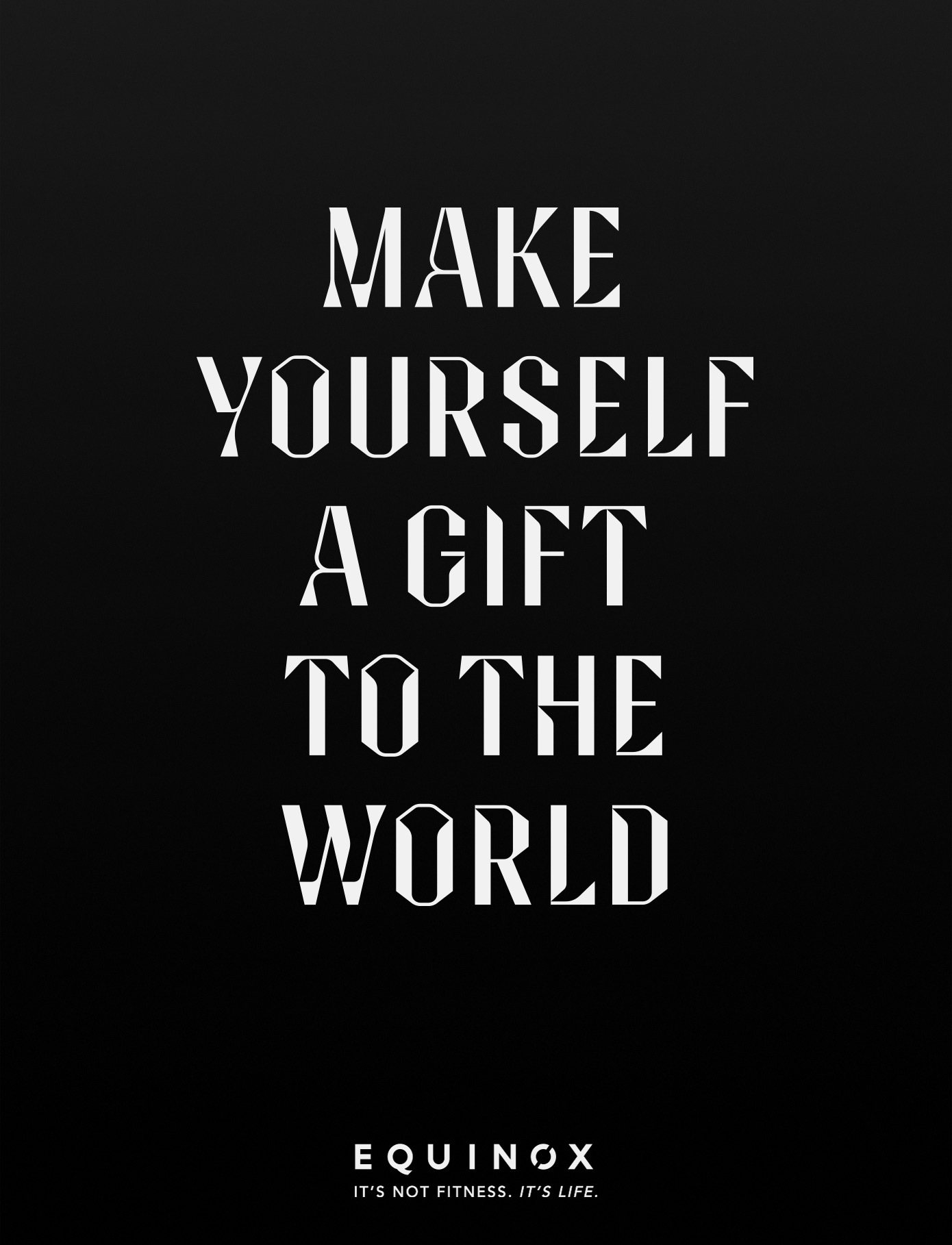
Bespoke campaign typography and system for Equinox gyms, with a tongue in cheek line proclaiming that if you ‘make yourself a gift to the world’ it will make the world a better place.
Commissioned by Droga5, New York.
Typography: Sawdust
Photography: Glen Luchford
Film Director: Floria Sigismondi
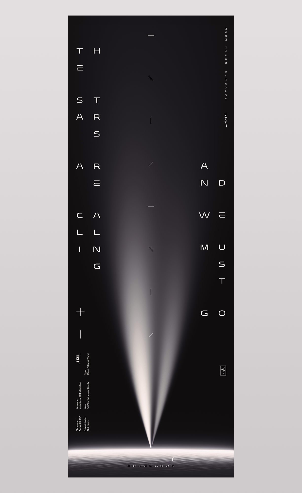
The Stars Are Calling and We Must Go
Few worlds in our solar system are as compelling as Saturn’s moon Enceladus. Covered in ice with the whitest and most reflective surface in the solar system, it has a deep flowing ocean beneath its frozen shell. On its south pole there are cracks and fissures that spray out ocean water directly into space, forming one of the rings of Saturn as it orbits. From these great plumes scientists have collected samples and determined that Enceladus has most of the chemical ingredients needed for life.
We were commissioned to create an art piece based on JPL’s planned mission to enter these vents and gain access to its hidden ocean.

This print pays homage to an excerpt from Carl Sagan’s book Pale Blue Dot. Sagan was inspired by an image taken, at his own suggestion, by Voyager 1 on February 14, 1990. As the spacecraft moved towards the outer edges of our solar system, engineers turned it around to gaze upon our tiny planet. Voyager 1 was approximately 4 billion miles away when it captured a portrait of earth, appearing only as a tiny point of light, a pale blue dot.
Sagan later described our planet as “a mote of dust suspended in a sunbeam”.
Created for CommUNITY, a collaborative project between Mucho & San Francisco Design Week (SFDW).

Poster for music artist Gryffin with supporting acts by Shallou and GhostDragon.
Client: Another Planet Entertainment

Cover typography for The New York Times for Kids, featuring 12 optical illusions that will leave you feeling dizzy.
Art Director: Debra Bishop

Typography for an article in WIRED, UK about reincarnating celebrities as holograms.
Recent Comments